Ureka App Design
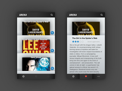
Still busy explorer UI design. Thought of a pretty cool concept for a book app, which can be applied to all sorts of other products.
The second screen is what you get when you expand one of the books on the first screen.
Struggling with the menu, which menu design do you prefer? Left or right? Let me know!
Let me know what you think and don't forget to press that L button!
More by Mathijs Lemmers View profile
Like

