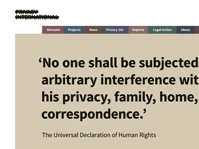
Privacy International Homepage
Privacy International was a challenge to work on; the website was built in house and they wanted a new theme but I could only use CSS due to security constraints. I couldn't change any of the markup of the templates (no HTML alterations i.e. adding wrappers to make my life easier) and the only real Javascript I used was for the mobile menu (I ensured it had a fallback.)
Their brand already had strong typography and black lines; they produce reports that had a few muted colours for covers so I had to turn these into a twelve colour colour palette.
The whole project was definitely a challenge but it was good to work with the client and their tech team to find the right solution for them within their security constraints that also looked good.
More by Katherine Cory View profile
Like

