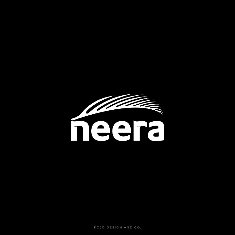
Logo Project the NEERA
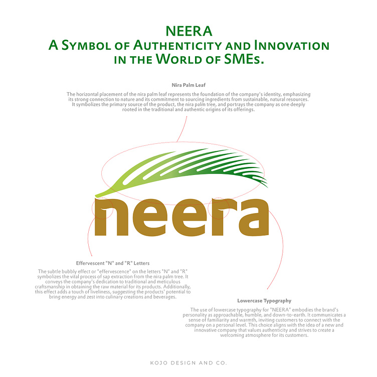
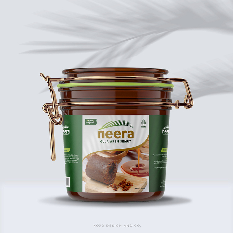
Embrace the Essence of Nature and Tradition with 'NEERA' – A Symbol of Authenticity and Innovation in the World of SMEs. 🌿🌟 Discover the Story behind this Thoughtfully Crafted Logo, representing the Finest Natural Ingredients and Modern Ingenuity. Join me in Exploring the Journey of Sustainability and Quality, as we Celebrate the Beauty of Tradition in a Contemporary World.Philosophy of the Logo Design for "NEERA":The logo for "NEERA" is crafted with a thoughtful philosophy that represents the essence and values of the company's products derived from the nira palm tree. Each element of the logo has been carefully chosen to convey specific meanings and create a lasting impression on the audience.
1. Nira Palm Leaf
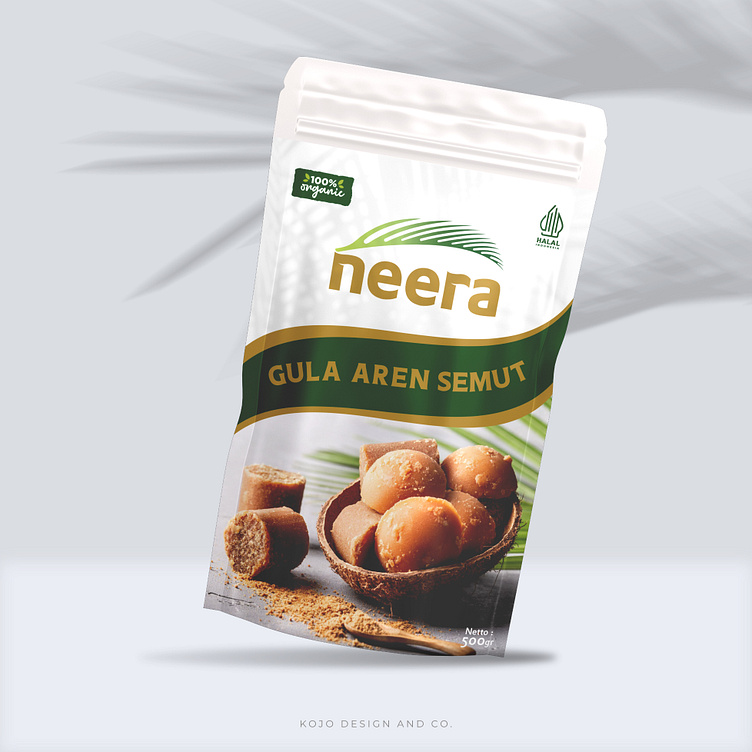
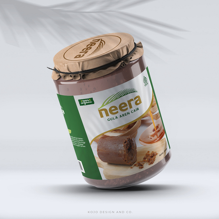
The horizontal placement of the nira palm leaf represents the foundation of the company's identity, emphasizing its strong connection to nature and its commitment to sourcing ingredients from sustainable, natural resources. It symbolizes the primary source of the product, the nira palm tree, and portrays the company as one deeply rooted in the traditional and authentic origins of its offerings.
2. Rounded and Pointed Leaf Shape
The design choice of having a rounded shape at the base of the leaf, transitioning into a pointed tip, signifies a harmonious blend of modernity and tradition. The rounded base denotes the company's embrace of contemporary methods and technology in processing the products, while the pointed tip reflects the organic and natural aspect of the production process. This juxtaposition represents the perfect balance between innovation and heritage.
3. Lowercase Typography
The use of lowercase typography for "NEERA" embodies the brand's personality as approachable, humble, and down-to-earth. It communicates a sense of familiarity and warmth, inviting customers to connect with the company on a personal level. This choice aligns with the idea of a new and innovative company that values authenticity and strives to create a welcoming atmosphere for its customers.
4. Effervescent "N" and "R" Letters
The subtle bubbly effect or "effervescence" on the letters "N" and "R" symbolizes the vital process of sap extraction from the nira palm tree. It conveys the company's dedication to traditional and meticulous craftsmanship in obtaining the raw material for its products. Additionally, this effect adds a touch of liveliness, suggesting the products' potential to bring energy and zest into culinary creations and beverages.
5. Gradation of Green and Golden Brown Colors
The gradation of colors in the logo holds significant meaning. The green hues, ranging from light to dark, represent the growth, vitality, and life force derived from nature, reflecting the purity and freshness of the ingredients. On the other hand, the golden brown color used in the typography symbolizes richness, sophistication, and premium quality, signifying the refined and superior nature of the products offered by "NEERA."
