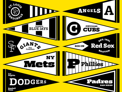
MLB Pennant flags
Some pennant flag illustrations I did to test and show my typeface in progress.
Slab serif family that looks what is there beyond solid in letter shapes. It is sturdy and dominant, but not constructed. It preserves dynamics without any particular influence of writing tools. Instead, it’s using contrast as a manipulated variable rather than fixed one. As weight grows, contrast increases only when neccesary to open up countershapes. There are 7 weights which are ranging from Thin to Black.
More by Marko Hrastovec View profile
Like
