Craigslist Mobile (Redesign Concept)

Was-sup! Dribbblers! Hope your're doing well!
Recently, I've been asking everyone's favorite 'AI language model' (chatgpt). For suggestions of ugly websites to redesign to practice my 'Ui/Ux design' skills.
Chatgpt went to doing its thing and gave me a prompt to redesign Craigslist. "Craigslist?" I thought. "Isn't Craigslist that ancient website that boomers used to use?" Not knowing what Craigslist actually was, I quickly went to searching. Yeah...I was not impressed. The interface looked outdated and cheap but slightly better than government websites.
My first thought after seeing the site was, "Why does it look like this?" That initial thought sent me down a short but interesting history about the website, its founder and its dated design.
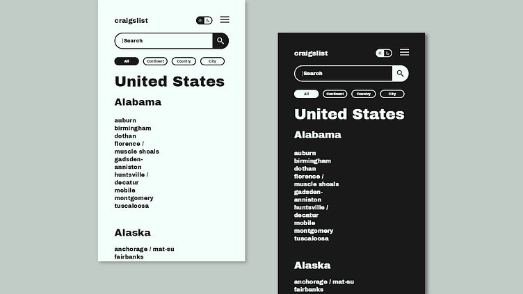
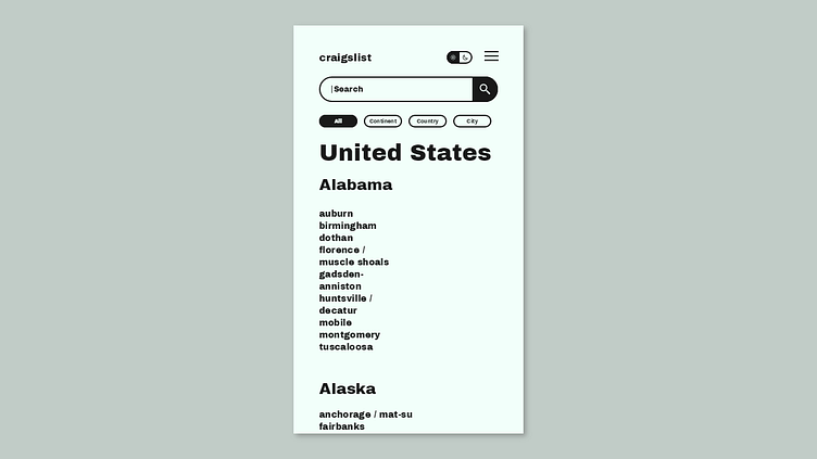
A word of minimalism was mentioned a bit. The founder Craig Alexander Newmark, is reported to have been interested in making a minimalist styled web design. Thus he opted for the web design we currently have. I decide to take that minimalist requirement and run with it, of course with a few more considerations added on.
Eventually ending up with the simple redesign of the home page for the mobile version of craigslist. [The desktop version (still dated) was more inviting than the stack of drop-down menus for the mobile home page. That's why I chose to redesign the mobile version first.]
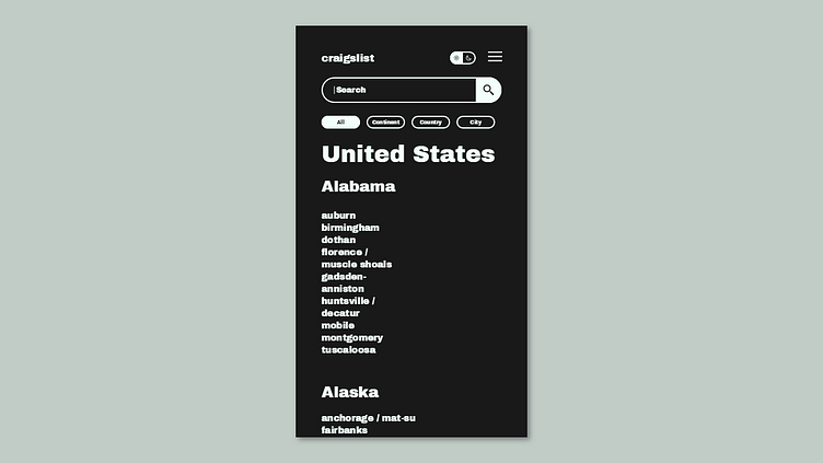
I chose a black and white color scheme for the entire design to represent the minimalist design. And to further represent that minimalist feel, I used the Archivo Black font from Google fonts. I intended to use a popular sans serif font like Poppins but the design looked deflated and under whelming with the stark contrasting black and white color palette.
Other suggestions also popped up. But after some long thinking I settled on the Archivo Black font which reminded me of a beautiful minimalist interface I saw a while ago. This all came together (with a few considerations) into the mobile home page redesign I presented.
The redesigns are not perfect but with the scrapped requirements from the web I believe that it provides an initial starting point for a truly minimalist themed craigslist web design. Not the supposedly 'minimalist design' craigslist is supposed to represent.
Thank you for reading this lengthy summary about the redesign of Craigslist's mobile home page.
Please leave a like if you liked it and your comments if you have something to say, most appreciated. Have a nice one. Peace!