Deaf Alerter Further
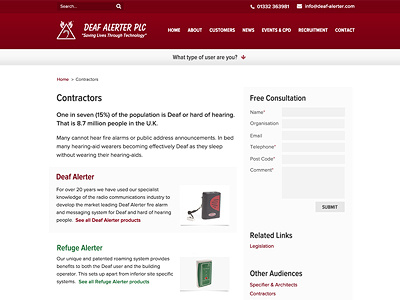
The further page designs show a collapsed user path option so the header takes up less space and have a quick contact form and relevant links to help the users navigate around the website.
I've really enjoyed using Font Awesome on this project, I'm surprised how easy they've been to design and code with.
More by Katherine Cory View profile
Like

