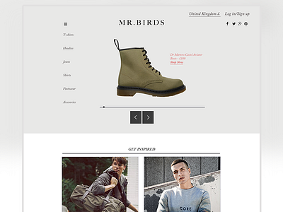
MR Birds Slide Navigation
Slide motion going from the side instead of down, easier navigation for the user and all links can be seen, first concept so improvements will be made. Photography is from ASOS.com purely to see how the UI would look for the University project.
More by David Hansel View profile
Like

