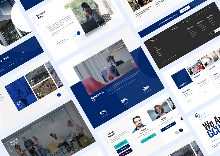
Glasgow Caledonian University: Component Refresh
I worked with Glasgow Caledonian University in enhancing their component library.
With no design system or brand book, Glasgow Caledonian University wanted to enhance and build on their website to empower users in their course search, and engage students through a contemporary new aesthetic.
I conducted multiple user interviews, exploring student preferences and understand the journeys that students feel inspired by and engage with the most.
I dissected the Glasgow Caledonian Logo, delivering a geometric glide shape that GCU could use moving forward within their brand materials and website. Within this project, I used the glide to achieve depth of field and brand reference points throughout, giving users a consistent visual.
Full Case study inclusive of Strategy, Journey Mapping, Testing, and Prototyping to follow.
