Logo Project - Wellberg Consulting

Creating a logo for a consultant company
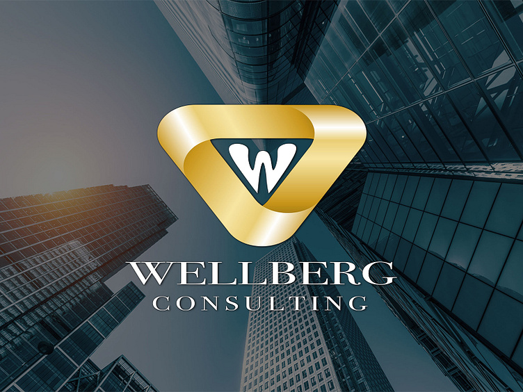
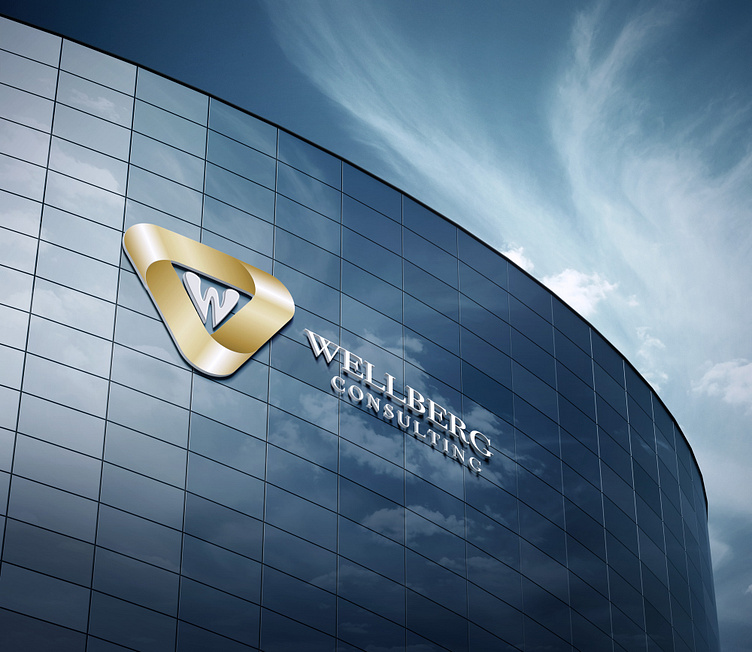
The newly founded consulting company led by Frank Wellberg commissioned me to create a logo for them. The client had no idea how the logo should look like and gave me total freedom of design, which appealed to me very much. First, I played around with the initial “W” a bit and designed an interesting shape of the letter. In the background of my mind I kept the keywords: confidence, strength, security, professionalism, wealth, success. I designed a golden ribbon around the letter “W” in the shape of an equilateral triangle.
trust security strength success
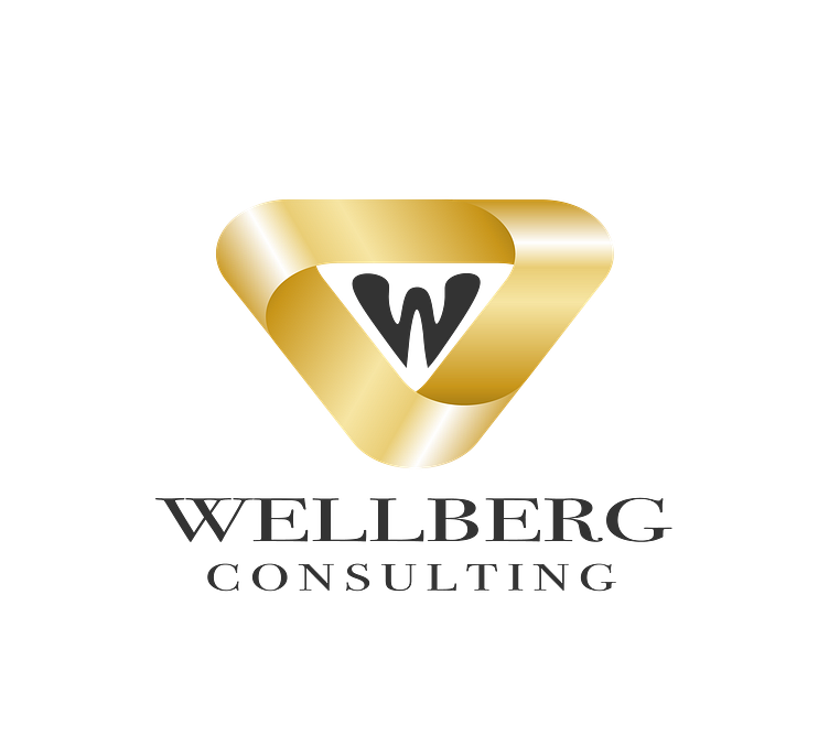
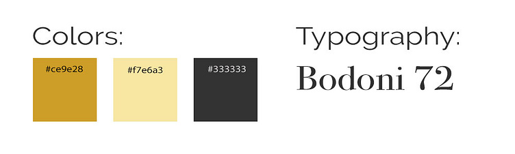
Gold symbolizes success and prosperity and the triangle suggests security, strength and confidence. I chose “Bodoni 72”, a classic serif font family, because it conveys seriousness, character and down-to-earthness.


do you want to see more?