Email Growth Experiment
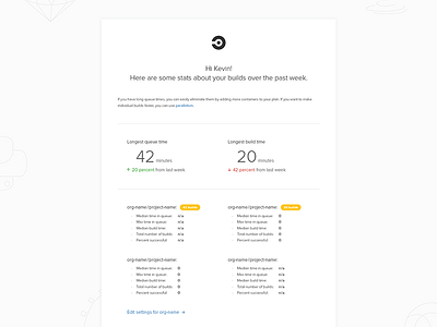
I enjoyed mocking this up, mainly because it was kind of a growth experiment, and the goal was to find out if people would click. The design wasn't required to be perfect or even good to validate the goal. For the first send, we didn't know if people would even open the email, so step 1 involved sending a plain text version. If we got a good open and click-through rate, we could start to improve the presentation. The first few rounds of emails were received well and the numbers were good enough to invest in adding some design and optimization work to make the email much better.
Since then we thought it might be interesting to add some sort of quick-facts section, with things like longest queue time time, longest build time, etc. We also talked about sorting projects by number of builds done per week, the yellow capsule shapes call attention to the top 2 projects.
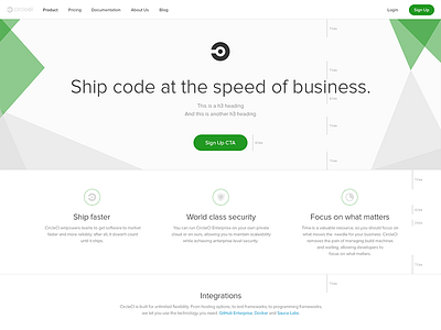
Again, we tweaked some of the text treatment and layout based on what we learned from launching our Enterprise Landing Page last week.
Kudos team!


