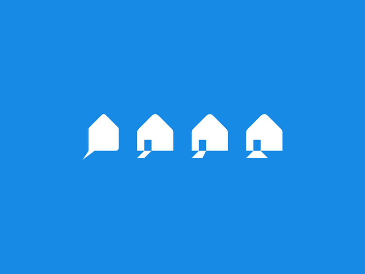
Realtor logo
BRAND | Realtor
In 2020 I pitched to upgrade the branding of a known realtor in Alkmaar. The logo wasn't very scalable at that time. I evolved the logo - as you can see - to a mark which isn't only scalable but also shows a lot of visual communication.
The client had a payoff stating to go ahead 1 stap. I translated this to the recognizable shape of a house with an open door. From which light "shines" appealing to new clients to buy or sell their home.
Unfortunately the client didn't pursue a change into this direction.
More by Marco Nieuwpoort View profile
Like
