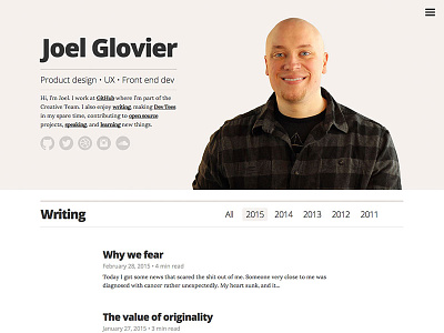
blog redesign
It's that time again. Last one was 2 years ago, so it was time for a refresh. Actually, the last one was really just a test of building a site with Jekyll. This one actually has thought out design, layout, etc.
Things I did:
- Moved to a more subtle and classy color scheme
- Changed from using Proxima Nova via local @font-face to Open Sans via Google Fonts API
- Improved typography and layout (optimized for blog reading)
- Added a jekyll/liquid based reading time estimator
- Took a self-portrait of my big old ugly mug and put it front and center because I'm so friendly 😉
- DRYed up my janky liquid index
More by Joel Glovier View profile
Like
