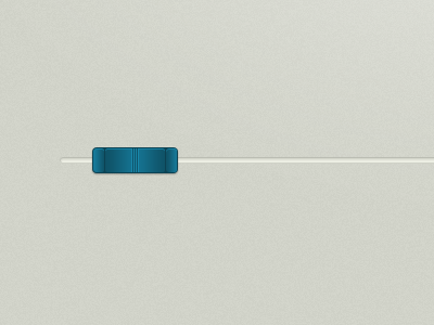
Slider
Not sure about this guy yet. Something seems off, but I can't put my finger on it. (I don't think it's the contrast in the strokes, since it kinda fits with the overall look of the site.)
Suggestions for improving it?
EDIT: BTW, light is supposed to come directly from above (90°).
More by Dan Beltechi View profile
Like
