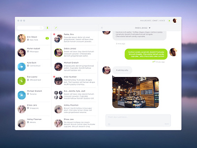
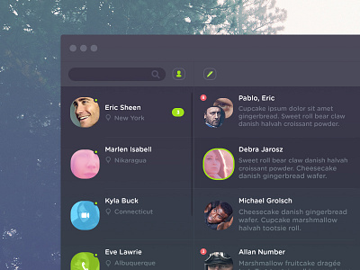
Chat app light
Thought a white version would look different, what do you think?
I should've at least collapsed the user panel but the search function would then have to stack as an icon and I didn't want that.
More by AccuVision View profile
Like


