Thoughtful Web Design
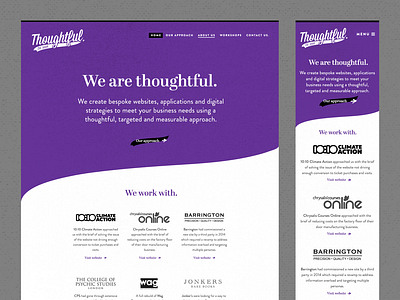
I'm fond of this design as I think there's a few subtle touches like the solid purple background behind the navigation and the full stop after the tagline.
I added texture to some of the solid colour blocks so the design wasn't too flat. I took the curve shape from the logo and I think it's a good way to separate the content but as the shape belongs to this brand, it becomes quite unique.
It was also helpful to create a design for another page so I could make a few more design decisions before creating a style guide. I always find the homepage is great to design at this stage but it's also helpful to design a more content heavy and standard page.
More by Katherine Cory View profile
Like

