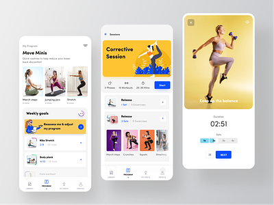
Women fitness app: light
Although the words equality and equity seems similar in real life, those have significant difference between them in UX design.
The UX which is designed for all is actually absurd. We try to make our apps inclusive. But the problem with inclusive design is that, it intend to serve all but indeed it serves NONE usefully!
Why? Because, different user has different needs and there equitable design rolls in. Every users have different needs. So, meeting the need of all users should not be our goal. We should focus only on our end-users, who the app is intended exactly for. Then serve them equitably. Equitable design means making experience useable respecting different needs of different end-users.
1 out of 6 billion people have some kind of disability. From vision, motor, literacy and other situational problems. Keeping this in mind while designing the app will produce equitable UX.
For example, we should not create only dark UIs. Some end-user may find it difficult to interact. So, we should give them the capacity to make the UI white.
Here is the light version of Women fitness app which I deigned few days ago.
If you can sacrifice some of your valuable time, please have a look my recent case study in Behance
--
Open for projects and full time remote position.


