Threepointer for iOS (3rd variant) - case study
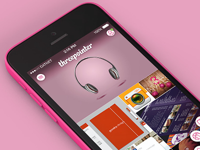
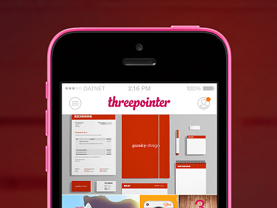
This is the third version for Threepointer (unofficial Dribbble app for Windows Phone) and what it might look like on an iPhone.
In this version I tried to get rid of all the unnecessary elements such as buttons and backgrounds, so the focus is only on the content itself.
Instead of having the regular tab bar at the bottom, I put a floating menu button in a corner. If you're right-handed, then the button would be on the right side and vice versa for the left-handed folks.
A tap brings up three main navigation buttons for a quick switch between the screens.
More by Stan Gursky View profile
Like


