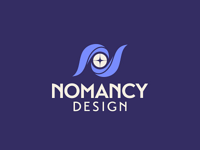
Nomancy Design Logo - 300/365
I know. I know. Three logo posts in a row is kind of cheating but I'm proud of this one and also wanted to hit 300 with it.
When getting to the type for this one, the main goal was to modernize. I had intentionally picked a less-modern D&D-style typeface for my original logo and while the idea was there, it just didn't feel like it held up super well in digital spaces. I picked Transat for my font this time, which, while inspired by Art Deco, gave me some runic type vibes with the tall, blocky letterforms.
As a throwback to my old logo, I curved the diagonal of the N. You can see how it normally looks in "DESIGN".
More by Bryan Richard Keith View profile
Like
