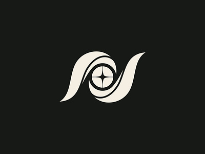
Nomancy Design Logomark - 299/365
The concept for the logo is wisps of energy swirling around a magical orb. I wanted to make sure the mark didn't feel random though, so the challenge was to find a way for these magical energy lines to have some sort of a plan. As I played with the concept more and more, I realized I could build them into an N shape, which, well you know that kind of works perfectly, doesn't it? Yeah, let's do that.
I originally had an 8 point star/spark in the center circle, slept on it, and the next day realized it was kind of reminding me of the Community episode where they made the butthole flag for Greendale. Four is simpler and looks better anyway.
I like that the logo can also be seen as an abstract eye, which helps for the kind of mystical/mysterious brand direction.
