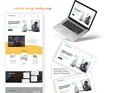
website design: software training landing page
Hello Dribbblers,
Presenting a Modern, Minimalist and Trending Landing page Design for Software development company Website. I tried to make it look clean with more empty space and with some cool bright colors for the design to make it more aesthetically appealing.
Please share your feedback about the color choice and placement of the elements.
If you like what you see, don't forget to press the ❤️ icon and follow my Dribbble and other social platforms to get exciting content and tips.
More by Abiola Olabanji View profile
Like
