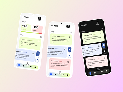
Mail App UI Design
🧾 Email app design concept that will receive the mails and perform the necessary and relevant actions.
📚 Typography - Inter(Heading, subheading, paragraph, and subtitle) typeface is popular and easy to read. The Inter typeface family. Inter is a typeface carefully crafted & designed for computer screens. Inter features a tall x-height to aid in the readability of mixed-case and lower-case text.
🌈 Colors - Blue(symbolizes trust, loyalty, and confidence), green(symbolizes balance, progress, and environment), and red (symbolizes Passion, Love, and enthusiasm)
👉You need a second to show some love by tapping the ❤ button and give valuable feedback.
Peace 😉!
🎉 Portfolio:
Behance: https://www.behance.net/suvamp
Dribbble: https://dribbble.com/suvamprasad
📞 Work-related queries contact me through:
Email: suvamprasad5@gmail.com
Instagram: https://www.instagram.com/suvamuxui
Twitter: https://twitter.com/suvamprasad2
LinkedIn: https://www.linkedin.com/in/suvamprasad
