Day 15 of #30daysofwebdesign
Hello there,
Day 15/30 - daily design for 1hr
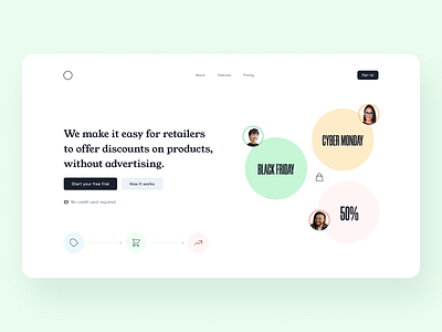
A company that makes it easier for retailers to offer discounts on products, allowing them to promote sales without advertising.
Hit the 'L' if you like it.
Any beginners who want to design this, check the screenrecord: https://youtu.be/mvbYLW17yCM
Do you prefer 1 or 2? Please let me know in the comments.
Save it and have a go. Let me know what you think in the comments.
My thought process:
1. Image
Shopping icons and people
2. Colour
Clean white and dark gray for both cta. Light mix colours
3. Headline
The benefit of making it easy for the retailer on a process
30 day challenge to design the hero section in 1 hour. Idea generated by https://ideasai.net/
Challenge set by @ransegall on instagram
Images from Unsplash
All challenges screenrecorded with tips:
https://www.youtube.com/watch?v=93iZT5UPA5g&list=PLXwCX7DBN7z3JvdxWmGy9YyMus8_XnzQT
Have a good morning, afternoon and evening

