Button Style
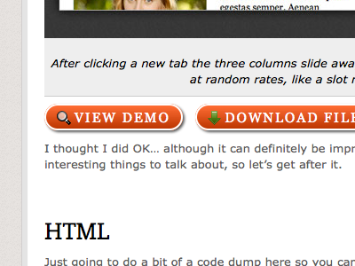
Changed up the button styles on CSS-Tricks. Still orange and button-y, but now they have a shadow, border, and icons.
See how the color peaks out from behind the border? I think that looks kinda bad... but I other wise like the style. Not sure if it's bad enough to lose the rounded corners (that's the cause of it). This is Firefox, it's worse in WebKit and Opera.
Also not sure about the green-on-orange, might need to mess with that hue.
More by Chris Coyier View profile
Like
