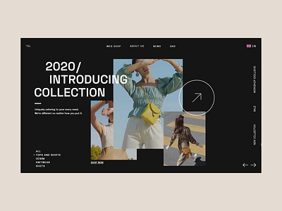
Fashion eCommerce Website - Dark Layout
We had recently created a concept for a light and minimal looking fashion eCommerce website and app which highlighted the subtle design techniques used! But that sparked the inspiration in us to create something that was the stark opposite of it but just as aesthetic and functional!
So here’s our take on a dark and bold fashion eCommerce Website!
The clothes pop and stand apart on the dark background, helping the user pick their favourite product easily out of the long list!
Another strength of this design is the bold typography that adds in the punch of boldness and helps the design come together!
Other design elements such as the arrows and lines bring a sense of completion to the design. These elements also add additional functionality which we will explore in the upcoming posts!
Which version do you like more? The light or the dark one?
Check out our other projects on Dribbble!
Press "L" or "F" to show some love! ❤️
We're available for new projects! 🤘 Let's talk at hello@pineapplestudio.in 📧
