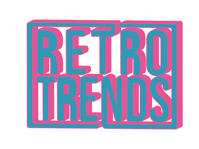
Retro Trends
This is a logo I did for a client up and coming online retail shop. He wanted the logo to give off an old school, 80s, and "retro" type of vibe. Spending some time looking at other online examples for inspiration and constant iteration, I sketched out the lettermarks that hit the spot for both the client and I (R and T). Afterwards, I moved to Illustrator to digitize and finish the logo. I finished it off by looking for a typeface that compliments the lettermark's anatomy, and manipulated the T and N to surround the logo.
More by Alexis Avalos View profile
Like


