DailyUI #054 - Confirmation
Good' evening Dribbblers 👋
This is my #054 #DailyUI design. 📽️🎫🍿
Design Hint 💻
Design a Confirmation UI element. What's being confirmed? Is it confirming an address, order, shipping, plane tickets, hotel reservation, dinner reservation, booking tickets to the opera, or something else? Also consider where it's occurring (i.e. website, mobile app, email confirmation, etc.)
The Idea 💡
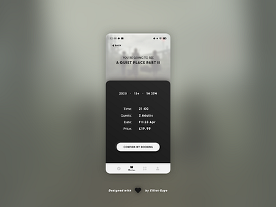
The idea for todays UI design is a confirmation screen for a mobile cinema booking app for Android and iOS. The screen will feature various snippets of information relating to the selected booking such as the time the movie starts, how many guests are booked for, the date and how much the booking costs. It will also feature the release year, age rating and running time for the movie booked. The overall design will be minimal and intuitive, allowing the user to glance over all the information within seconds for ease of use, it will also feature a monochromatic colour palette, along with a blurred background of the current movie, to further immerse the user into the app and boost the excitement level.
Final Thoughts 🧠
It's glanceable and minimal, yet rather informational relating to it's purpose. The user can gain a lot of vital information from this screen relating to their desired booking, before they actually confirm the booking itself.
The user will first see a prominent title of the movie they are booking for atop a blurred image of the movie itself, near the top centre of the screen, along with a back button to return to the actual dedicated movie's info screen. Below the title is the informational part of the screen, where the user can view the movie's release year, age rating and run time, along with the actual booking specifics such as the time the movie starts in the cinema, how many guests/viewers are attending, the date at which the movie is shown and the price of the booking. Underneath the information snippets is the actual confirmation button that the user will tap on to confirm their reservation/booking. Finally, a bottom aligned 'navbar' finishes off the screen, allowing the user to navigate through the entire app 'globally'.
Overall, it's been a chill afternoon of designing my minimalistic, yet informational booking screen. I quite like the end result and I think the screen achieves it's purpose rather well, while also being aesthetically pleasing.
Share the love, press "L" or "F" if you ❤️ my work!
As always, I welcome any feedback! 😄
- Elliot
