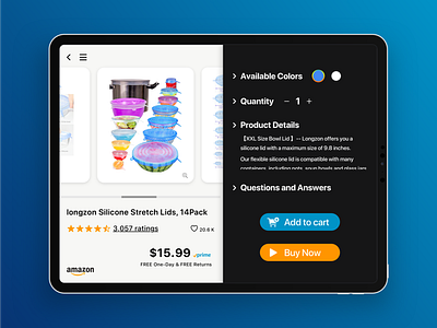
Day 12 E-Commerce Shop (Single Item)
I asked my mom:" What's the greatest challenge when using your most commonly used eCommerce app (Taobao, a Chinese app)?"
"Lack of flexibility." She said.
Here is the reason why: My mom always likes to check her order history when she is adding something new to her cart.
With the current app, she has to return to the home page, then select the "Profile" page where she can search her order history.
Thus, when I was redesigning the amazon IPad app, I made sure to include a three-dash "more" button on the top left corner, so that the app is versatile enough to include some shortcuts.
Another challenge I encountered was to balance the amount of information within the limited space. I combined "save for later" and "add to list" to "like". It would be more efficient for users to simply add something to their love list and organize later.
Hope you enjoyed today's design! Have a nice day!
