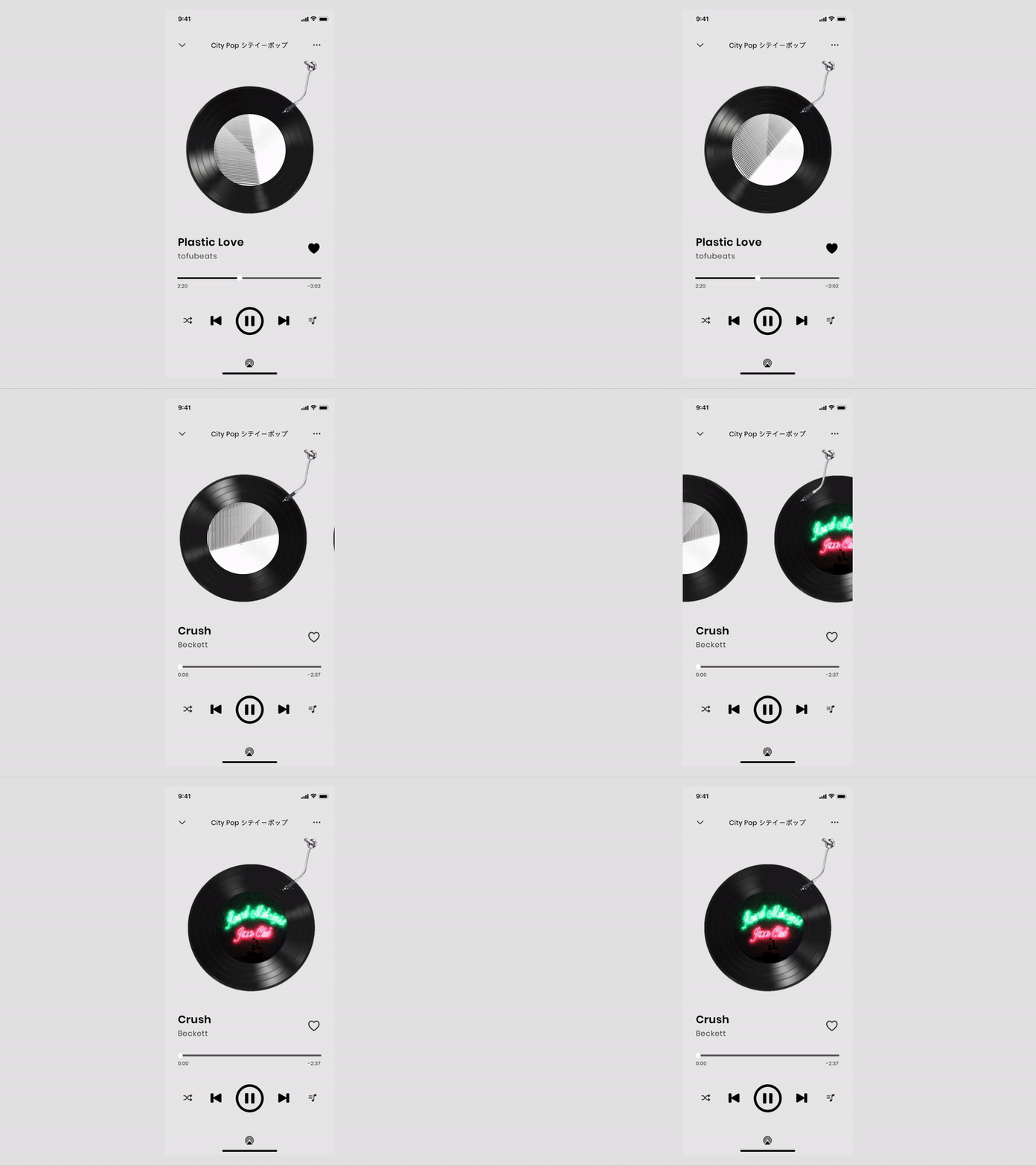
Day 9 Music Player
Instead of designing a Discovery interface, I decided to explore possibilities towards a More menu.
Ideation:
I found myself reaching for the More button quite often, and none of the mainstream music apps are user-friendly enough in my opinion.
I recalled when I first pressed the More button in the Spotify app, I got confused by "Go to the radio". Thus I changed the term to "Discover Similar" to make it more understandable.
Also, I prioritize the Share button in order to encourage sharing of music with close ones.
Most users use music players to relieve stress, thus I incorporated the "Vinyl record" theme into my design and made sure to leave enough space to avoid overwhelming users with fancy functions.
More by Ava Xu View profile
Like


