DailyUI #041 - Workout Tracker
Good' evening Dribbblers 👋
This is my #041 #DailyUI design. 💪💪💪
Design Hint 💻
Create a UI related to monitoring health or tracking various workout/training routines. It could be for a personal workout, for a team, or even gym equipment tracking someone's workouts.
The Idea 💡
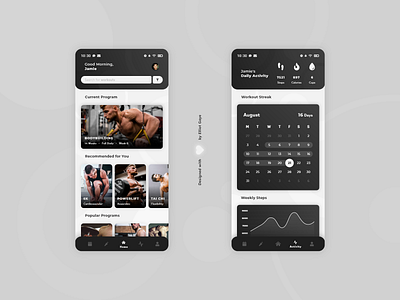
The idea for today’s UI design is a workout/fitness app for Android and iOS. The app will have various features including activity tracking, various workout programs, nutritional advice and personal profiles - with sub features within all mentioned. The design will rely on a 'card' structure to display each workout and statistic, followed by a monochromatic Black and White gradient colour palette. Some shading and neurmorphism will also be scattered throughout the design, along with some abstract circle shapes to spruce things up.
Final Thoughts 🧠
Wow! It was a long afternoon, but I'm loving the final result! I think the 'card' design really works for this UI, since each workout/program is easily acknowledgeable at a glance, and helps with overall app UI consistency (which was one of my main areas of focus today).
With the home screen [LEFT], the user would first be introduced into the app via a small welcome message, they can either then search for a specific workout straight from the home screen OR filter out workouts using the 'filter' feature. The user can then see their current 'workout program' which takes priority over the rest of the 'workout cards', speaking of which, the user can then swipe down the screen to view a varied number of categorised workouts, first of which is called 'recommended for you' workouts, after that being 'popular programs' and so on. All the user would need to do is tap the desired workout/program 'card' to begin their new fitness journey. The entire app makes use of a 'global' navigation through the use of a bottom-fixed 'navbar', with icons going left to right - Current Program screen - Nutrition screen - Home screen - Activity screen - Profile screen.
With the activity screen [RIGHT], the user would first notice their 'daily activity' via the combination of iconography and typography at the top of the screen, relaying the user's current 'steps', 'burnt calories' and 'cups of water drank' data reports. To keep consistency throughout the UI of the app, I decided to keep the 'card' design going to this screen too, with each 'statistic' occupying its own 'card' and spaced title, just like the home screen. After the user has viewed their daily activity, they can then start to scroll down the screen, noticing their current 'workout streak' in the form of a calendar, then noticing various 'curve graphs' relaying data on a varied number of statistics to do with their weekly activity (e.g. weekly steps).
Overall, its been a long and interesting day of designing, and I'm glad I focused on that consistency! It's a fitness app that tracks your workouts and activity, giving you nutritional advice along the way, all while being fun and intuitive to use. I love what I have designed this afternoon!
Unsplash photo credits 📷
@visualsbyroyalz, @aloragriffiths, @alexanderredl, @karthikhimself, @spanic, @erik_lucatero
Share the love, press "L" or "F" if you ❤️ my work!
As always, I welcome any feedback! 😄
- Elliot
