DailyUI #038 - Calendar
Good' evening Dribbblers 👋
This is my #038 #DailyUI design. 📅📅📅
Design Hint 💻
Design a Calendar focused element. Is it for scheduling an appointment? A reservation, flight, hotel, or concert calendar? Is it a calendar reminder feature? For email or something else entirely?
The Idea 💡
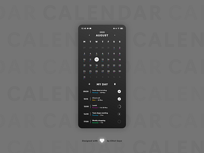
The idea for today’s UI design is a calendar app for Android and iOS. The app will feature a large month by date calendar nearer the top of the design, with an equally large 'to do' list sat underneath. The design will feature a flat and minimal aesthetic while looking sophisticated in nature, it will also have 'dark mode' colour palette to give it that sophisticated feeling while also being more accessible in any condition.
Final Thoughts 🧠
Today was just about trying to figure out how to go about (rhyming not intended) designing the 'to do' list nearer the bottom of the UI. It took some time, but I think it was worth it since it looks pretty clean! I made use of space in this design, with each element spaced out by a fair margin. This space gives the overall look of the design that clean, sophisticated and modern feeling.
The 'dark mode' gradient makes all the other UI elements pop within the screen and also makes for more usability at anytime of the day. I decided to add some colour to the design in the form of a 'tag' feature, this allows the user to view their day much easier and also makes for an easy overview of their entire month, with the help of small coloured dots under each numbered day of the calendar. These dots are also structured in a way so that the correct colour displays at the right time of day underneath each date (e.g. for the 12th August, going from left to right on the dot area, it would display as - Blue - Yellow - Purple - [LINE BREAK] - Blue - Green).
The scrollable 'to do' list displays a bold time for when a task is due to start, a small sentence to describe the task, its associated 'tag', the duration of the task and to the very right is a circle button for which the user can tick the task off, see the progression the task and set a notification alarm to get a heads up of an upcoming task. The list also has the features to either delete existing tasks or add a new task.
Overall, it's been a mind-boggling day trying to figure out my design, but I got there in the end and I think it's paid off, because I love the look of my calendar!
Share the love, press "L" or "F" if you ❤️ my work!
As always, I welcome any feedback! 😄
- Elliot
