Day 2 Credit Card Checkout
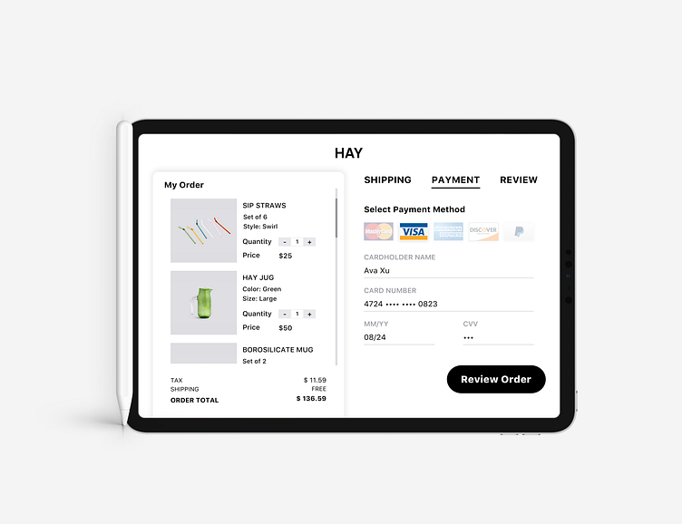
This time I am coming up with a Credit Card checkout page on the iPad pro platform.
It is my first time designing for the Ipad platform and I definitely encountered challenges. The interface is much more spacious than the iPhone interface so I was debating among so many options.
I am designing for one of my favorite brand: Hay. Since their website style is Clean, Concise while a little Retro, I was trying to mimic the left side in the form of a grocery receipt.
I hate the PURCHASE NOW or PLACE ORDER button for many retail websites, as they give me a sense of compelling me to hand over my exam paper before I review everything again. Thus I made sure to place a REVIEW ORDER button to release the pressure and make users enjoy the clean interface. Hope you enjoy this one.