DailyUI #029 - Map
Hey Dribbblers 👋
This is my #029 #DailyUI design.
Design Hint 💻 - Design a map. Not one of those old school paper ones though. Ok, that might actually be kinda neat too.
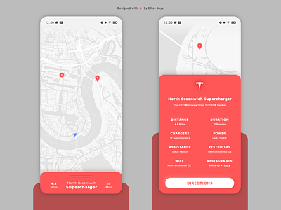
The Idea 💡 - The idea for today’s UI design is a Tesla charging station location app for mobile for Android and iOS. I don't have a lot of time today to focus on this UI since I will be busy but I will try to produce something of a standard, if not more. The design will feature a light theme map along with a solid Red primary colour palette, to follow along with Tesla's design theory. The overall layout, look and feel of the app will be minimal, yet informational.
Final Thoughts 🧠 - I like it, considering the amount of time I had to spend on this UI, I think its gone really well! When I first viewed the brief I was like "I've already designed a map for one of these DailyUIs (specifically #20)", so it was a little bit puzzling at first. After a little while I thought of an idea to locate Tesla superchargers, and viewing Tesla's actual app for Android, the actual map doesn't look too "pretty", to me anyway and I'm pretty sure it doesn't have a locate feature as similar to my idea - so it made total sense to follow through with this idea and make it more aesthetic, user friendly and informational. The overall design looks fantastic and the combination of the bright Red with the light White map theme works in harmony and looks beautiful. The expanded (swiped up) UI (RIGHT) layout is simple and to-the-point, with all the vital information laid out before the user's eyes, along with a "directions" button to get the proper directions to the selected charging station. Overall, the past few hours of designing and creating this UI have been chilled out and enjoyable and I love my end result.
Credits - Tesla for their logo and charging station details.
Share the love, press "L" if you ❤️ my work!
As always, I welcome any feedback! 😄
- Elliot
