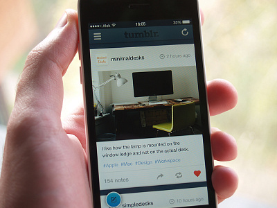
Home view
Hey hey,
This weekend I started a small concept project - exploring the general look and feel of Tumblr in new iOS. Now, I didn't want to remove all shadows and change the layout of the home screen completely.
• Improved visual style of navigation bar
Added a slide menu here instead keeping the tab bar, so that way more content is available in total preview.
• Spread the content to the full width of the screen
Kept the card layout, but now people are more focused on actual content (images & text info) and it's much easier to see time of the post and amount of notes.
Attached real pixels.
Looking forward to hear some thoughts.
--
Cheers.
More by Aleksandar Đurić View profile
Like
