Peoples Church of Montreal Logo Redesigned by The Logo Smith
Client: Peoples Church of Montreal Designed: 2014 (still in use 2020)
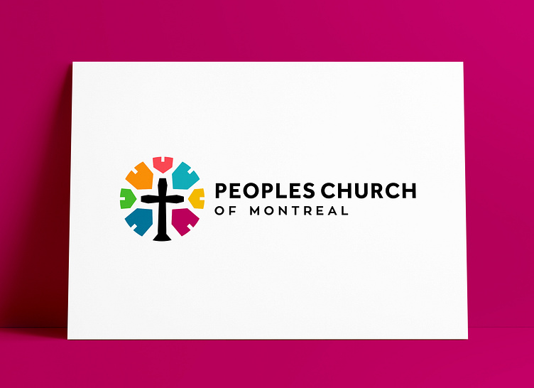
One of my favourite Church logos, even whilst we used a cross, it was great to find a slightly different way to frame it. By using coloured houses, to represent the 'people' and the sense of 'community'.
If you're interested in the Case Study of this then link is below:
Case Study & Project Page: Peoples Church of Montreal
———————————
CLIENT TESTIMONIAL by Jason Penalosa “We really really liked the concept with the houses pointing towards the cross that The Logo Smith came up with.
It truly represents how the church is family oriented and centred on the cross, while depicting the church as a hub for the city dwellings; it’s just brilliant!
The fact that this logo can be adapted to be a badge as well is really amazing.
We can’t thank Graham enough for the unique reimagining of our church logo; it’s far better than we had ever hoped for!” - Jason Penalosa
———————————
The Logo Smithakasmith.™
→ smith.gl/portfolio → smith.gl/hire-smith
The Logo Smith aka smith.™ – a British freelance logo designer extraordinaire – has over 28 years commercial experience, in: Logo & Brand Identity Design; Logo & Brand Redesigns & Updates; Icon Design; Label & Packaging Design; Social Media Branding; WordPress Development (SEO, Security & Performance); Lithographic & Digital Printing; Reprographics; Advertising & Marketing.
