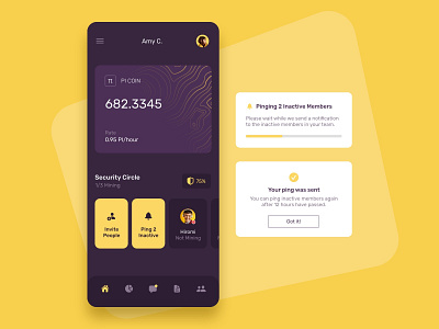
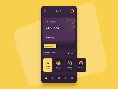
Pi Coin Home Screen
I did a quick redesign of the Pi Coin app.
Here's why 👇
⚠️ Problem
The current design of the app doesn't focus on clarity and simplicity. The background image, information presented, and layout keeps changing. This can result in trust issues with users.
💡 Solution
A clean, simple, and consistent design of the home screen, focusing on the most important aspects of the app - the user's current balance, and the status of their security circle.
⚠️ Problem
The current apps makes it unclear to users whether the app is a wallet or not. Matter of fact, this is one of the most common questions on the team chats.
💡 Solution
The creditcard-like design makes it clear that mined coins are stored on the user's account.
💡 Other Benefits
- Pinging your team to remind them to mine is now right on the home screen instead of hidden on a separate page.
- Inviting people is also right on the home screen, instead of hidden on multiple separate pages.
- The app does not block you from using it until you have checked in for the day, instead you have a prominent slider on the home screen reminding you to do so.
- You can clearly see which users are mining, not mining, and already pinged.
💰 Need an invite?
Visit https://minepi.com/zakovska and use the invite code zakovska


