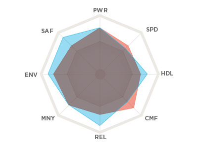
Comparison Chart
A quick little chart for a pitch I'm working on. The type was just thrown on there, so it may not align correctly... and for that matter, the shape layers may have gotten blurry on the resize. Regardless, hope to be able to show the final version live, one day...
More by Bryan Le View profile
Like
