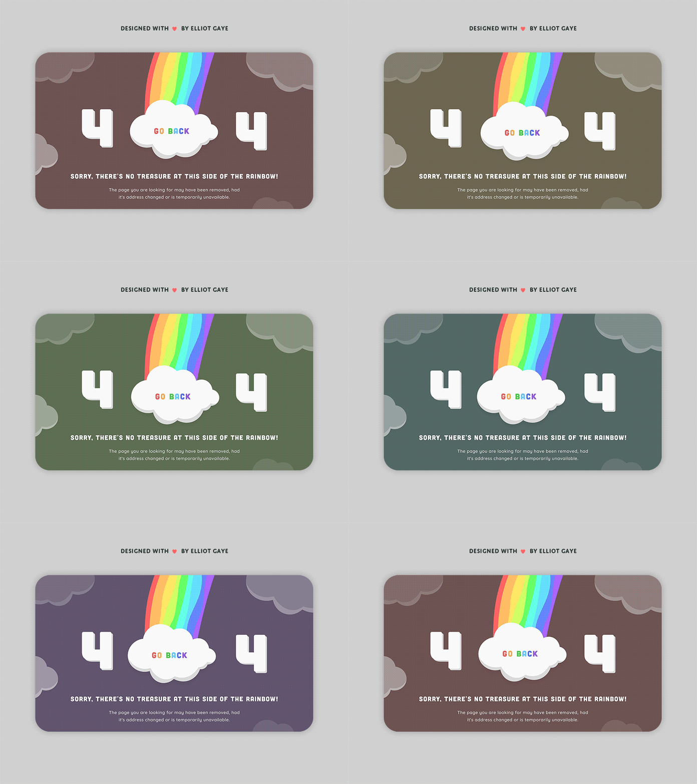
DailyUI #008 - 404 Page
Hallo Dribbblers 👋
This is my #008 #DailyUI design.
Design Hint 💻 - Design a 404 page. Does it suit the brand's style? Is it user-friendly? It might sound mundane, but not evertyhing can be flash or glamorous. Every day millions of people will be landing on 404 pages. You have an opportunity to help them in a way that's useful and asthetically pleasing.
The Idea 💡 - The idea for today’s UI design is a 404 not found page for a theoretical fun and colourful website. I've put my own catch to this task which is; it has to include some kind of rainbow aesthetic. Therefore, I am planning on making a colourful and aesthetically pleasing page that gives all the information a user would need.
Final Thoughts 🧠 - With the half a day I have spent on designing and animating this piece (just past Midnight of typing), I think I've done well! It's been fun coming up with something so colourful and eye catching. I tried to make something funny (with their not being any treasure at the end of the rainbow) but also informational to what the page actually is and what to do next; and I think I've done exactly that. I have also done some more illustrating of my own with this piece, which was fun. However, once I got around to converting my animation to a .GIF for Dribbble, it lost a lot of fidelity (2400x1600 down to 800x600 - also came with some artefacts at this level, too 😔) which I'm not too chuffed with but hey - I would rather have my envisioned animated piece on here than a still image. Overall I'm happy with what I achieved today and I hope you like it too!
Press "L" if you ❤️ my work!
I welcome any feedback! 😄
Lastly, share the love by pressing the share button if you really like what you see! 👍
- Elliot
