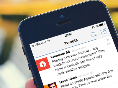
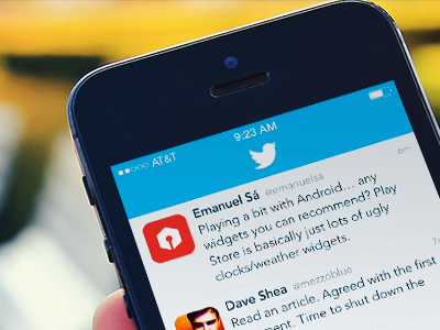
Native Twitter for iOS 7
I took the liberty and modified Mike’s Twitter shot as an exercise in how to create a truly native look when porting existing apps to iOS 7, all the while not messing with the basic layout and features. Plus: Helvetica Neue FTW. ;)
I'm fully aware that some of my decisions go against Twitter’s idea of having “the same experience across all devices”, but I don’t see how they can keep this up without having their apps feel out of place.
Anyway, field notes:
- Link color is taken from Twitter’s About page. Since we should keep it clean, the color gets propagated to UI tint color.
- Birdie branding on Home button, since navigation bars should stay out of the way. Also allows for use of “Tweets” title.
- Full width layout, so no rounded corners for avatars.
- Shot features a progress bar, i.e. fetching new tweets.
- Didn’t take the time to properly adjust Compose, Connect & Discover icons.
Cheers.


