Hlibny Dar
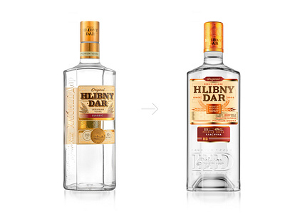
The new design’s updated logo is more readable. The basic graphic elements are now more modern, while preserving their sense of tradition. The taste identifiers are larger, making it easy to find the right taste within the product line. The shape of the bottle was also changed and is now taller and slimmer with a new original engraving. The choice of natural colors emphasizes the natural ingredients.
More by Reynolds and Reyner View profile
Like
